Why your Brand Needs Multiple Logo Designs?
If you’re new to business or have been in business awhile, but haven’t worked with a professional designer before you’ve probably been digging through the depths of Google wondering so many things about your branding. One of those questions may be, “How many logos do you actually need for your business?” Let me add, it seems like the information you’ll sometimes find on Google can vary and confuse you even more. Trust me, I’ve been there before.
While at first this question may puzzle you, you may think “One logo is all I need and all people see I thought?” Well, that isn’t necessarily true. You won’t only use your logo in one place. Your logo will be used across so many applications and platforms, all of which have different sizing and orientation requirements.
Why your brand needs multiple logo variations
As a service-based business owner, you’ll want to showcase your logo on your website, store signage, email signature, social media, and various print materials like postcards, brochures, and thank you cards. Having only one version of your logo means that you’ll be limiting how well-suited your logo will be across the various platforms and applications you use. To summarize this, using only one logo limits your brand’s marketing abilities!
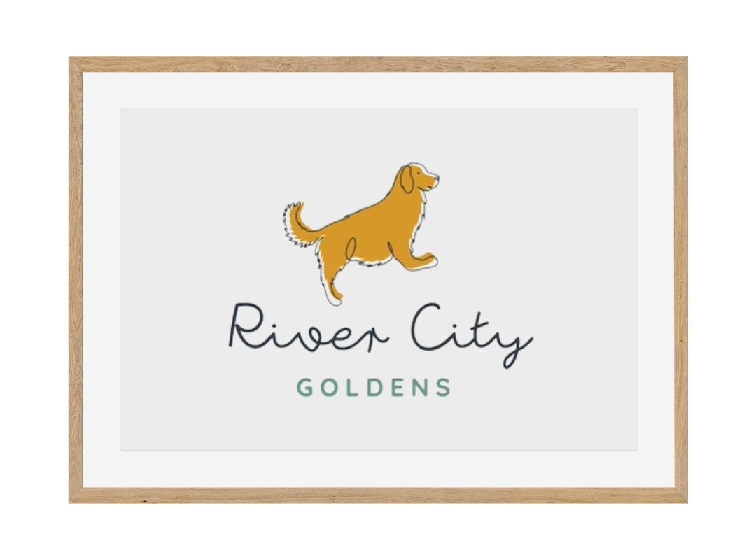
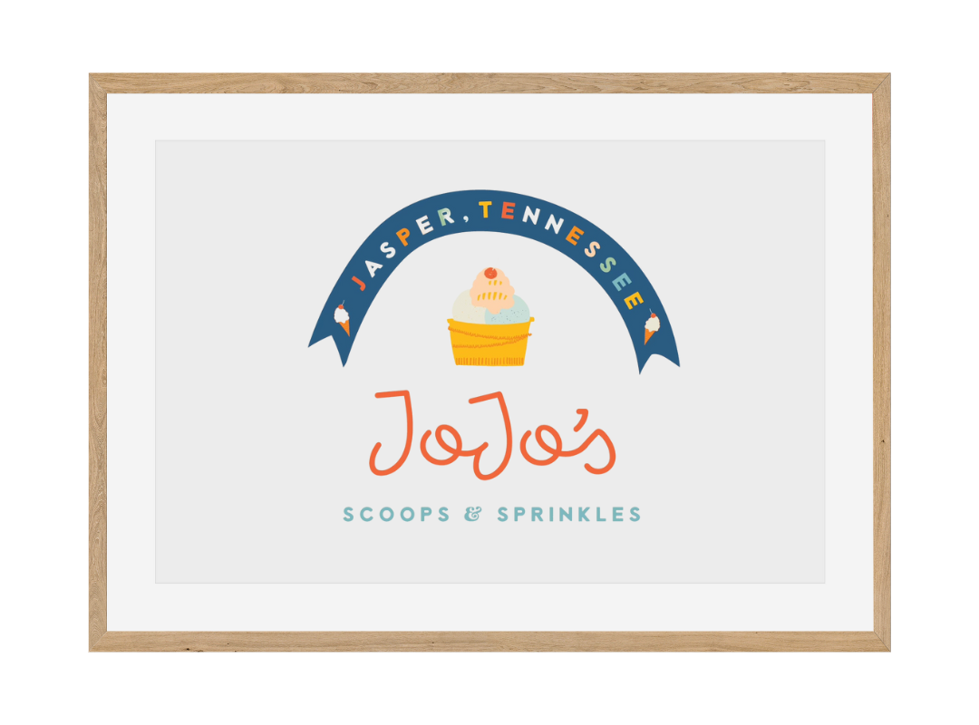
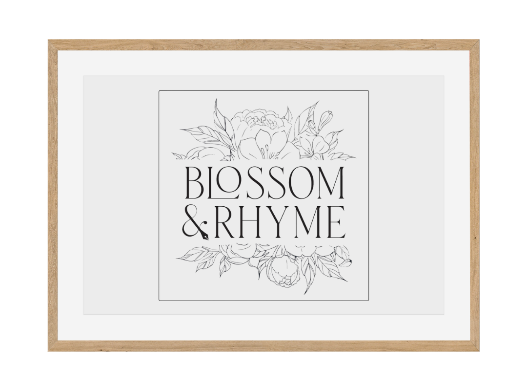
For every brand Wood Media works with - however big, small, new or old - we always create multiple versions of your brand’s logo. This can range between 2-5 logo versions, not including additional icons that may be created, depending on your project. This allows you to have a family of logo variations that can be used in a variety of ways, while still feeling cohesive and recognizable. People will start to recognise your brand overtime for more than one logo, icon, and even the brand color and fonts paired together.
Case Study: Cayla Horey Coaching
As humans, we are pretty visual people, we like to see more than one example. So take a look at how we took Cayla Horey Coaching’s brand and turned it into a fresh set of logo variations along with brand colors and fonts.
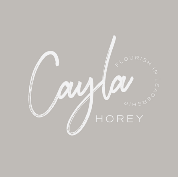

When Cayla Horey first came to us, she had lots of inspiration and knew exactly what she wanted, and who she wanted to attract with her logo, but she wanted to have a professional do the logo design for her. She came to Wood Media only wanting a logo to start advertising her new business. But after educating on the importance of having multiple logos for your business, Cayla’s brand was born.
We decided to create some alternate versions of her logo in order to give her flexibility to use her branding however she pleased.
First we designed the primary logo which is is main logo used to market your business. This logo would typically be on signage, letterheads, etc.
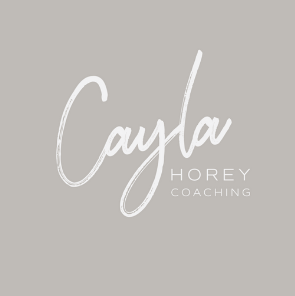
Second we designed the secondary logo which is great for smaller areas that a primary logo may not fit such as website headers, stickers, and other print materials.
Then we used the same design to create a submark which can be used for Cayla’s website favicon and social media.
More logos = more flexibility and brand recognition.
Creating additional logos also gave us more opportunity to design logo elements that are meaningful and not just lines. Sometimes it can be difficult to convey everything you want to your audience with just one logo.
Think of this as if you’re learning something new, not everyone has the same learning style so it’s crucial to have variation. Some people learn best with a video, others learn better following along step-by-step, while others would rather watch and listen first.
